
Farm investing with a cleaner layout, calmer color system, and a more credible first impression.
VeltrixYield is shaped to feel more premium from the first screen: clearer opportunity cards, stronger visual hierarchy, and a smoother path from discovery to funding.
How it works
Full GuideThe flow is now arranged to remove hesitation: understand the package, fund comfortably, then track from one place.
Create your account
Register in a few moments and access your dashboard.
Fund your wallet
Deposit an amount you are comfortable starting with.
Choose a farm package
See the investment amount, expected return, and duration before you proceed.
Track and withdraw
Monitor your cycle and proceed with withdrawal when the package completes.
A stronger front door for the platform
The biggest changes are not just colors. The homepage now moves from confidence to process to package discovery in a more natural order.
Why choose VeltrixYield?
The redesign focuses on confidence, clarity, and usability so the platform feels more serious before a user even signs in.
Money-first package view
Projected outcomes are shown in Ghana cedis so the value feels immediate and easy to compare.
Stronger hierarchy
Buttons, spacing, and section rhythm now guide the user through the page instead of competing for attention.
Mobile-first polish
The experience stays sharp on phones, where many first-time visitors will decide whether the platform feels trustworthy.
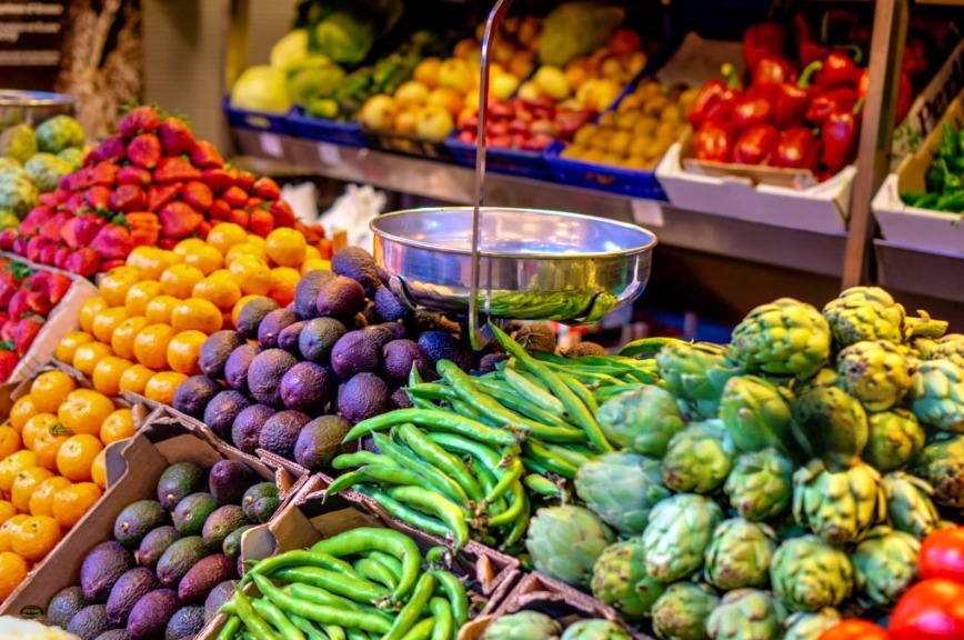
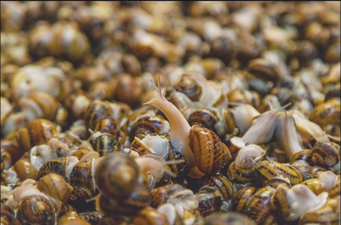
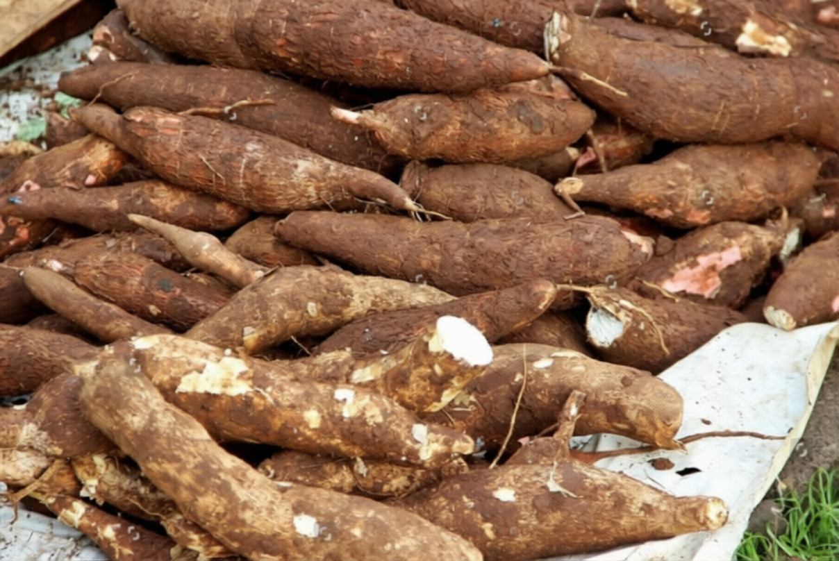
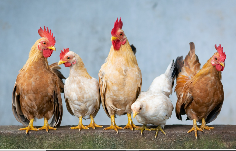
Featured Farms
View All FarmsEach package card is trimmed to the details that matter most before a user opens the full farm view.


Questions new users usually ask
A few concise answers keep the page informative without overwhelming a first-time visitor.
How do I start?
Create an account, fund your wallet, choose a package, and monitor the cycle from your dashboard.
Do I see the return before investing?
Yes. Each farm package displays the investment amount, the expected return in GHS, and the duration.
Can I ask questions before joining?
Yes. Use the chat button on the page or the contact page for support guidance.
Open your account and explore the platform with a more premium experience from day one.
Create your account, fund your wallet, review live farm packages, and manage the full journey from one dashboard.